OpenZhenZhen AI 提示词画廊 · gpt-image-2.5 · image
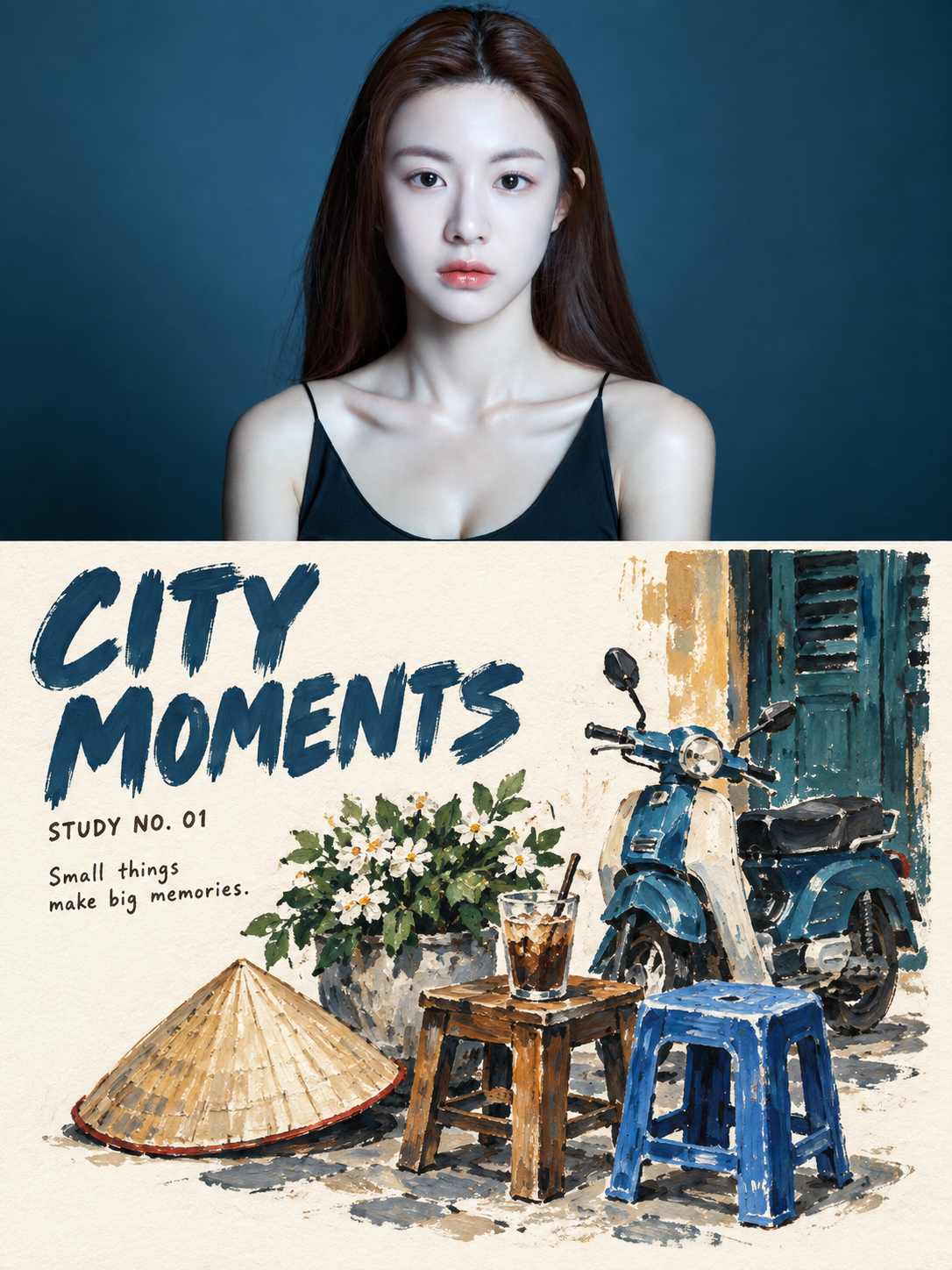
浓彩水粉旅行静物摄影对比海报
Vibrant Gouache Travel Still Life Photography Contrast Poster
来自 OpenNana 的图像提示词,已按本地图像分类和站点 gpt-image-2.5 归类整理。 使用时需上传人物参考图;本流程使用统一参考人物生成示例。
提示词 / Prompt
中文提示词
以用户上传的参考图作为主要可见人物的面部身份依据。在不与身份参考冲突的情况下,保留来源的场景、造型、服装、姿势、构图、光线和视觉风格。 请将我上传的每一张旅行照片分别制作成一张独立的「浓彩水粉旅行静物」对比海报。每张照片单独输出,不得把多张照片拼接在同一作品中。 整体采用3:4竖版构图。画面上下分为两个高度接近1:1的区域,使用清晰、平直、克制的水平边界;不得渐变、羽化或让颜料侵入照片区域。 上半部分忠实保留原始照片。准确保持主体身份、数量、姿态、建筑结构、街道方向、物件关系、真实材质、自然光影与原有色彩氛围,仅进行轻微的旅行杂志与艺术出版物调色,并加入极薄的胶片颗粒。上半部分仍须明确是一张真实摄影,不得插画化、拉伸、镜像、复制或改变主体。 下半部分不要完整重画原场景,也不要将整张照片简单水粉化。先理解照片,再从中选择4–8个最能代表地点与旅行记忆的城市物件,例如摩托车、自行车、塑料矮凳、咖啡桌、灯笼、花篮、餐具、雨棚、窗格、道路标线或招牌轮廓。 将选出的物件重新组织成一组非对称的旅行静物。允许改变物件的尺度、距离、遮挡和空间组织,使其像从旅途中拾取并重新摆放在纸上的城市标本。静物团约占下半区域的45%–68%,周围必须保留一块连续、完整、没有零碎装饰侵入的温暖米白色纸张。不要把所有物件沿底边平均排列,也不要填满背景。 使用真正不透明的浓彩水粉,结合少量丙烯和干刷质感。色彩完全从原照片提取,并压缩成4–7种主色。使用直接、哑光、覆盖力强的颜料色块;轮廓采用照片中最深的深棕、蓝黑或炭灰,以松动、不均匀、略带迟疑的手绘线条完成。保留可见刷毛、干刷缺口、颜料厚薄变化、毛糙边缘、少量寻找线与底纸透出。高光使用未覆盖的纸白或直接的白色水粉笔触。 默认加入三组准确文字: 1. 根据照片内容提炼一个1–3个英文单词的主标题。 2. 加入“STUDY NO. 01”形式的编号。 3. 加入一句5–10个英文单词的简短观察句。 主标题必须在聊天预览尺寸下清楚可读。采用粗厚、略窄或略圆、轻微歪斜的手绘水粉大写字,具有哑光不透明颜料、可见刷毛、干刷缺口、毛糙边缘和不均匀手工字距。标题应像直接用画笔刷在纸上,而不是后期叠加的光滑数字字体。 编号和观察句使用清楚可读的小号人文无衬线、旧铅字或轻松手写体,允许轻微缺墨、纸齿和手工错位。文字颜色从原照片及水粉静物中提取,并与主体形成呼应。文字放置在连续留白中,可以与静物边缘产生轻微咬合,但不得遮挡关键主体。 只能渲染提示词中逐字写定的文字。不得生成虚构地名、日期、品牌、招牌、作者名、签名、Logo、二维码、水印、乱码或额外长文。 Avoid: transparent watercolor wash, full-scene tracing, same-crop redraw, photorealistic painting, smooth digital gradients, airbrush, clean vector outlines, oil impasto, plastic 3D, cartoon, anime, childish coloring-book style, copied shop signs, fake labels, tiny unreadable typography, thin polished magazine fonts, floating digital text, excessive decoration, filled negative space, missing source-photo comparison. 最重要的规则:上半部分必须保留真实原始照片;下半部分必须主动提炼城市物件并重新构图,使同一个旅行地点变成一组具有浓彩水粉质感、手绘标题和大片纸白的旅行静物。
English prompt
Use the uploaded reference image as the facial identity reference for the main visible person. Keep the source scene, styling, clothing, pose, composition, lighting and visual style unless they conflict with the identity reference. Please make each of my uploaded travel photos into an independent "Rich Gouache Travel Still Life" comparison poster. Each photo is output individually, and multiple photos must not be stitched into the same work. The overall layout uses a 3:4 portrait composition. The frame is divided into two top and bottom areas with a height ratio close to 1:1, using clear, straight, and restrained horizontal boundaries; no gradients, feathering, or allowing paint to invade the photo area. The top half faithfully preserves the original photo. Accurately maintain the subject identity, quantity, posture, architectural structure, street direction, object relationships, real materials, natural light and shadow, and original color atmosphere, with only slight travel magazine and art publication color grading and extremely thin film grain. The top half must still be clearly a real photograph and must not be illustrated, stretched, mirrored, copied, or have the subject changed. The bottom half should not completely redraw the original scene, nor should the entire photo be simply gouached. First understand the photo, then select 4–8 urban objects that best represent the location and travel memories, such as motorcycles, bicycles, plastic low stools, coffee tables, lanterns, flower baskets, tableware, awnings, window panes, road markings, or signboard outlines. Reorganize the selected objects into an asymmetrical group of travel still lifes. Allow for changes in the scale, distance, occlusion, and spatial organization of the objects, making them like urban specimens picked up from the journey and rearranged on paper. The still life group occupies about 45%–68% of the bottom area, and must be surrounded by a continuous, complete piece of warm off-white paper with no fragmented decorations invading. Do not arrange all objects evenly along the bottom edge, and do not fill the background. Use truly opaque rich gouache, combined with a small amount of acrylic and dry brush textures. Colors are completely extracted from the original photo and compressed into 4–7 primary colors. Use direct, matte, highly opaque paint blocks; outlines are done in the deepest dark brown, blue-black, or charcoal gray from the photo, completed with loose, uneven, slightly hesitant hand-drawn lines. Retain visible brush bristles, dry brush gaps, thickness variations in paint, rough edges, a few search lines, and the base paper showing through. Highlights use uncovered paper white or direct white gouache strokes. Three sets of accurate text are added by default: 1. Refine a main title of 1–3 English words based on the photo content. 2. Add numbering in the form of "STUDY NO. 01". 3. Add a short observation sentence of 5–10 English words. The main title must be clearly readable at chat preview size. Use thick, slightly narrow or slightly rounded, slightly slanted hand-drawn gouache uppercase letters, featuring matte opaque pigment, visible brush bristles, dry brush gaps, rough edges, and uneven manual kerning. The title should look like it is brushed directly onto the paper with a paintbrush, rather than a smooth digital font overlaid later. The numbering and observation sentences use clearly readable small-sized humanist sans-serif, old lead type, or relaxed handwriting, allowing for slight ink deficiency, paper tooth, and manual misalignment. Text color is extracted from the original photo and the gouache still life, echoing the subject. Text is placed in continuous white space and can slightly bite into the edges of the still life, but must not block key subjects. Only render text explicitly written in the prompt. Do not generate fictional place names, dates, brands, signs, author names, signatures, logos, QR codes, watermarks, garbled code, or extra long text. Avoid: transparent watercolor wash, full-scene tracing, same-crop redraw, photorealistic painting, smooth digital gradients, airbrush, clean vector outlines, oil impasto, plastic 3D, cartoon, anime, childish coloring-book style, copied shop signs, fake labels, tiny unreadable typography, thin polished magazine fonts, floating digital text, excessive decoration, filled negative space, missing source-photo comparison. Most important rule: The top half must preserve the real original photo; the bottom half must actively extract urban objects and recompose them, turning the same travel location into a group of travel still lifes with a rich gouache texture, hand-drawn titles, and large areas of white paper.
探索更多图片和视频提示词 · 生成图片 · 生成视频 · 在 AI 画布中创作
相关作品
- 韩风手绘涂鸦感人物海报
A Korean-style illustrated half-body portrait poster that preserves the visible identity in the configured person reference, with expressive ink-and-pastel doodle art.
- 几何折纸蓝图风蜘蛛侠
Hyper-detailed folded-paper SpiderMan blueprint preserving the source geometry, blueprint annotations, minimal paper-and-ink palette, studio lighting, crisp shadows, architectural-art style and photorealistic paper detail. The configured reference is attached only as the workflow-required generic id
- bunny girl
单人竖版电影宣传海报,真人电影摄影质感。一位20岁的亚洲成年女性,五官精致,身形丰满匀称,黑发松松挽起,几缕发丝垂在脸侧。佩戴黑色缎面兔耳、白色领结与腕饰,身穿露肩、露背、高腿剪裁的黑色缎面连体舞台服,不透明面料完整覆盖胸部与臀部,肩颈、背部、手臂和大腿自然裸露,腰后点缀小巧的白色绒球兔尾。 她侧背对镜头站在暗红色天鹅绒帷幕之间,肩背舒展,轻轻转头回眸。嘴角上扬,微微露齿,眼尾含笑,笑容自然、妩媚而灵动,目光自信。细腻眼线、柔和腮红与玫瑰色唇妆衬托精致面容。取景从兔耳顶端至膝盖上方,脸部位于画面上三分之一,人物轮廓清晰,姿态优雅。 深黑、酒红与琥珀金构成浓郁的戏剧色调。一束暖金色聚光从侧后
- 真实照片与动漫插画融合
以一张真实的对镜自拍照片为参考,创作一幅细节丰富、风格迷人的混合媒介插画。画面中,一位年轻女子站在现代电梯内,正用智能手机对镜自拍。她留着深色长发,戴着圆框眼镜,神情放松,身穿浅蓝白条纹短款纽扣衬衫、宽松蓝色牛仔短裤,脚踩厚底白色运动鞋。 在她身旁,绘制同一个女孩的可爱 2D 手绘动漫形象,发型、穿搭、身材比例、手机和姿势都要与真人保持一致。插画角色需具备超大且富有表现力的眼睛、圆框眼镜、红润的脸颊、蓬松凌乱的黑色长发以及俏皮可爱的身形比例。两个版本的人物都应摆出相同的姿势:一只手臂自然搭在头顶上方,呈现随性又默契的对镜自拍姿态。 艺术风格:将写实摄影与手账风动漫插画完美融合。使用随性的黑
- 酒吧兔女郎
电影宣传海报,极致光影,人像叙事感,主角为20岁兔女郎,无文字,性感,妖媚,丰满
- Z世代少女与拉布布的橙调时尚大片
以当前配置的人像作为泛化人物身份参考,创作橙色影棚中的超写实时尚大片:人物、真人大小的毛绒Labubu玩偶与英国短毛猫共同入镜。 | Use the currently configured portrait as the generic subject identity reference for a hyper-realistic orange-studio fashion editorial featuring the subject, a life-sized furry Labubu character, and a British Shorthair cat.